
The consultant website that wins retainers
Most consultant websites describe services when they should name the buyer's problem. Here is the page-by-page architecture that turns a referral into a signed retainer.
A referral just gave someone your name. That person is now on your website, deciding whether to email you or quietly move on. You will never know which they chose.
We have built and rebuilt this exact site more than 300 times for authors, coaches, and independent experts, and the pattern of failure is remarkably consistent. It is almost never design. The site looks fine. The site simply does not do the one job it has.
Most consultant websites describe the services on offer. The consultants who win retainers name the buyer’s problem first, in the buyer’s own words, and only then say what they do about it.
That sounds like a copywriting note. It is actually an architecture decision, and it changes what pages you need.
Why “describing your services” loses
Read your own home page and count how many sentences are about you — your methodology, your years, your accreditations, your three pillars — versus how many are about the situation your client is in right now.
The ratio on most expert sites is roughly ten to one. And the reason is sympathetic: your expertise genuinely is the product, so it feels correct to lead with it.
But the buyer is not shopping for expertise in the abstract. They have a specific, slightly embarrassing problem: the leadership team keeps re-litigating the same decision, the sales hires keep failing in month five, the new market entry has stalled twice. They are scanning your page for evidence that you have seen their exact situation before.
“Strategic advisory for high-growth organisations” gives them nothing to match against. So they leave, and you conclude your website does not work — when in fact it worked perfectly, as a mirror.
The positioning page: one sentence a referrer can repeat
The real test of your home page is not whether it converts. It is whether somebody who read it once, three weeks ago, can describe you accurately to a colleague.
That means the top of the page needs one sentence with three components: who you work with, what specific problem you solve, and the outcome. No metaphors.
- Weak: “I help ambitious leaders unlock their potential.”
- Working: “I help Series B founders rebuild a sales team that stopped hitting quota after the first two hires left.”
The second one is narrower, and narrower is the point. Narrow sentences get repeated because they are repeatable. Broad sentences get forgotten because there is nothing to hold.
Read it aloud to somebody in your market. If they respond “so what does that mean in practice?”, it is not done.
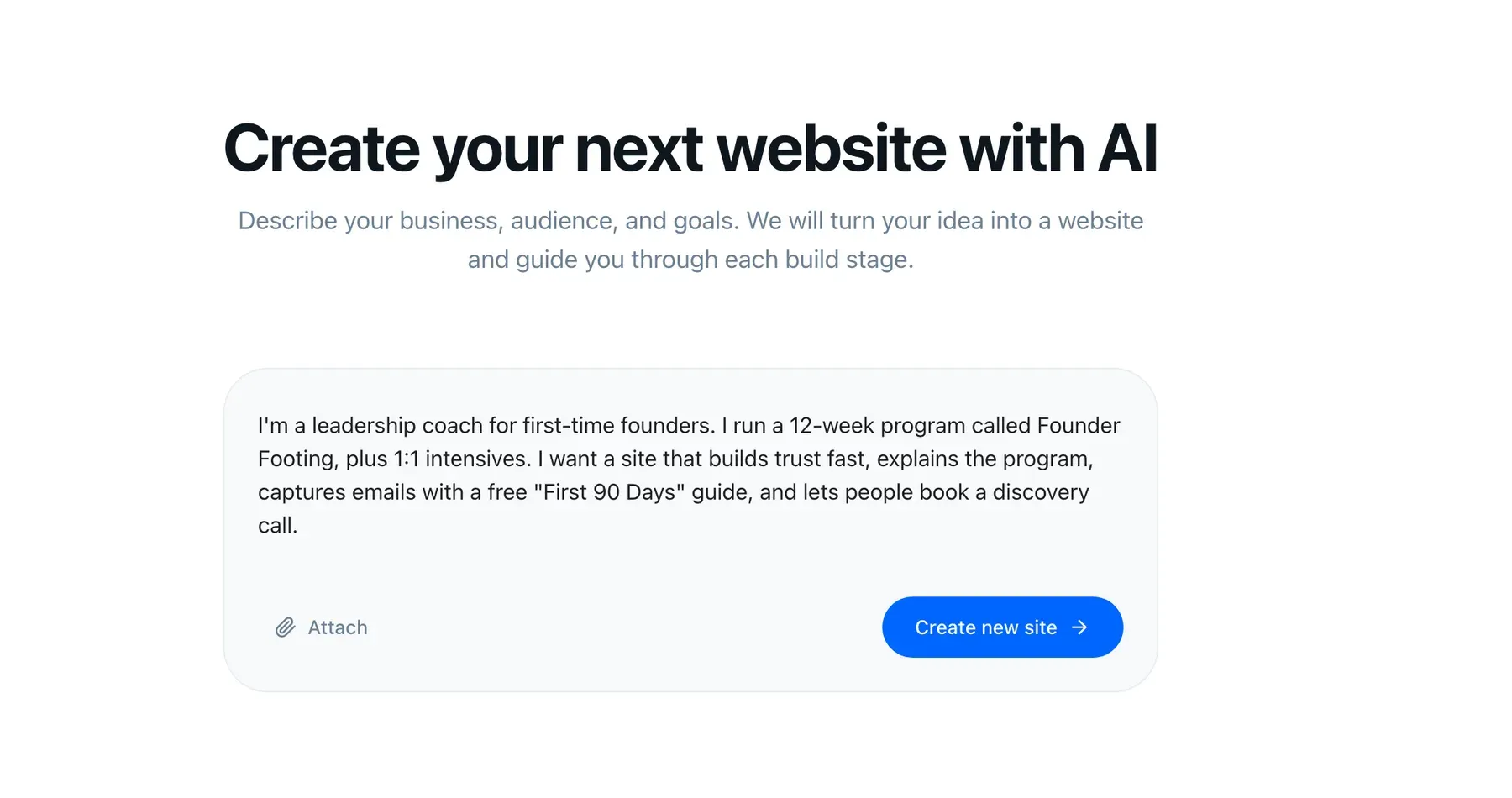
The reason we start with a conversation rather than a template is that this sentence determines everything downstream. A site built around “leadership consulting” and a site built around “post-Series-B sales rebuilds” need different pages, not different fonts.
Proof structure: numbers or named constraints, not logos
The logo wall is the most common proof pattern in consulting, and it is the weakest. It answers “have you been near serious companies?” — a question nobody asked. It does not answer “can you handle my situation?”
What works is two or three case studies with this shape:
- The situation, with its constraint. Not “the client wanted to grow” but “they had eleven weeks before the board meeting and could not hire.”
- What you actually did. Including the part that was uncomfortable.
- What changed. A number if you have one. If you are bound by an NDA, a named constraint works nearly as well: “cut the approval chain from five people to two.”
- What you would do differently. Optional, and disproportionately persuasive. It reads like someone who has done the work rather than someone selling it.
Two of these beat twelve logos. They also give a referrer something concrete to say about you, which loops back to the positioning problem.
Anonymise where you must. “A 40-person fintech in Berlin” is credible. “A leading organisation in the financial sector” is not.
The “how I work” page pre-handles the objections
Every consulting buyer arrives with the same four private worries: how much of my time will this take, what happens if it does not work, will I get you or a junior, and how do we start without committing to something enormous.
Most sites leave all four unanswered until the call, which means the call gets spent on logistics instead of on the problem. Worse, some buyers never book the call precisely because those worries are unresolved.
So write the page. Plainly:
- The shape of an engagement. “Two weeks of diagnosis, then a six-week build, then monthly.” Buyers need to picture the calendar.
- What you need from them. Access, time commitment, who has to be in the room. Saying “four hours of your team per week” filters out the wrong clients and reassures the right ones.
- Who does the work. If it is you, say so — it is one of the strongest advantages you have over a firm.
- How it ends. Consultants who explain the exit are trusted more than consultants who imply permanence.
A good how-I-work page turns the first call from an interview into a working session. That single shift is worth more than any redesign.
Pricing: publish a floor, not a fixture
Here is the opinionated part, and we will defend it.
Publish something about money. Not necessarily a price list — a starting figure, a typical engagement range, or a minimum. “Engagements typically start at $12,000” does more work than any other sentence on a consulting site.
The standard objection is that publishing prices removes negotiating room and invites comparison shopping. In practice, from watching hundreds of these pipelines, opacity costs more than it protects:
- You spend calls on people whose budget was never in range, and those calls are your actual inventory.
- Serious buyers with real budgets read total silence as a signal that the answer is uncomfortable, or that the price depends on how much they seem able to pay.
- The competitor who published a number got contacted first, because certainty is easier to forward to a CFO.
You keep flexibility by publishing a floor and a shape rather than a fixed price. “From $12,000 for a diagnostic, most retainers between $4,000 and $9,000 monthly, depending on scope” reveals almost nothing about your margin and filters your inbound sharply.
If you genuinely cannot publish figures — public sector work, regulated procurement — publish the process instead: how a quote is produced, what drives it up and down, how long it takes. Never leave the money question blank.
One next step, and one only
Count the calls to action on your current site. If there are five different things a visitor might do — download the guide, join the newsletter, book a call, follow on LinkedIn, read the blog — you have distributed one decision across five weak options.
Pick one. For most consultants it is a short conversation, framed as useful rather than sales: “a 30-minute call where we look at your situation; if I am not the right person I will tell you who is.”
Then put that same step at the bottom of every page and nowhere else. The newsletter can exist; it should not compete.
Capture the lead, then actually follow up
This is where most independent practices leak the most revenue, and it has nothing to do with the website’s appearance.
An enquiry arrives as an email. It gets read on a phone between meetings, mentally filed as “reply tonight”, and rediscovered eleven days later underneath a thread about invoicing. Meanwhile the same person has messaged you on LinkedIn, so the context is split across two systems and neither has the whole picture.
The fix is unglamorous: every form on the site writes into one contact record, tagged with where it came from and what page it came from.
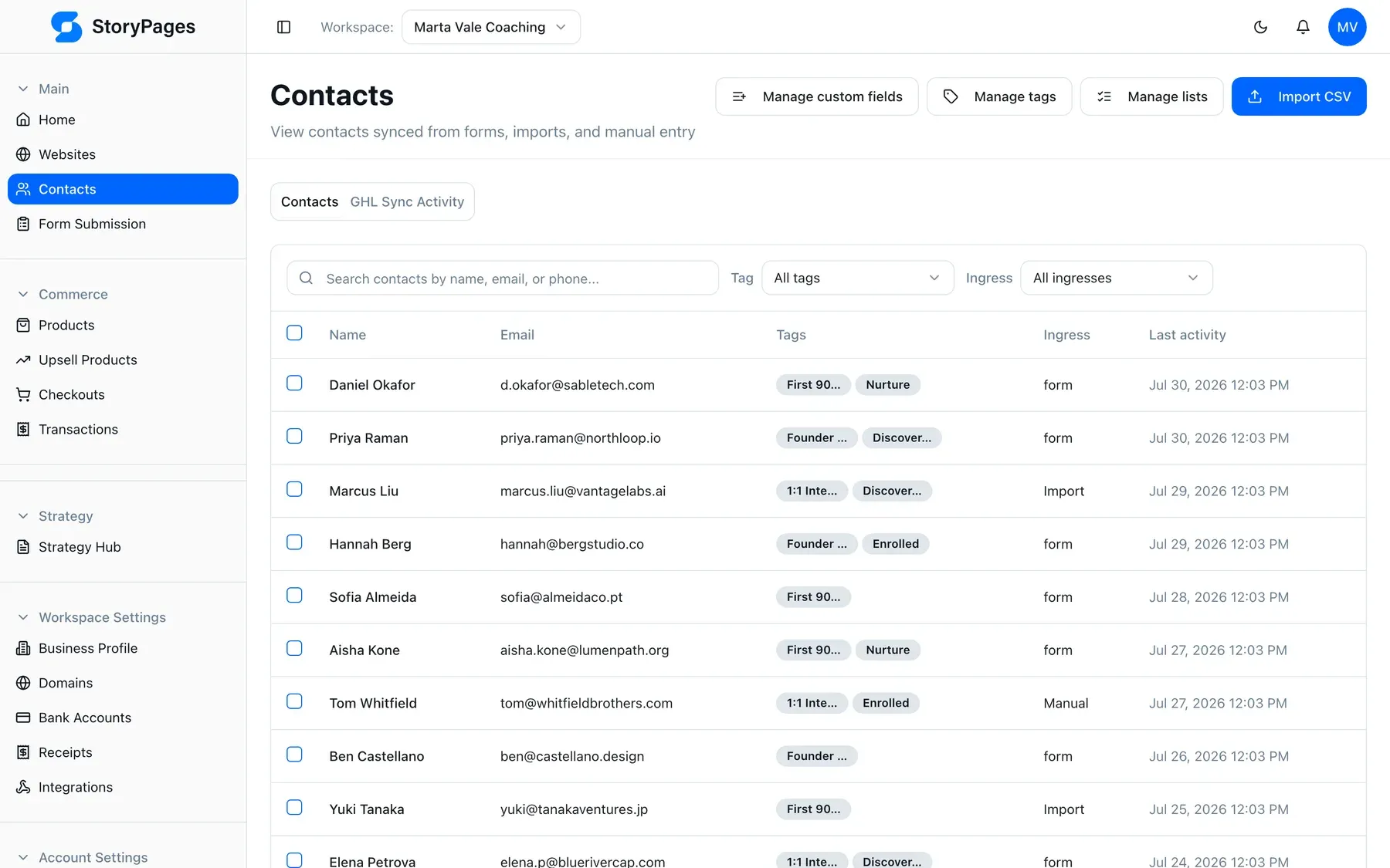
Then three automations cover almost everything a small practice needs: an immediate acknowledgement, a tag recording how they found you, and a reminder if nobody has replied in two days. In StoryPages the CRM and email are part of the same product as the site, so there is no integration project between the form and the follow-up.
A consultant taking six new clients a year does not need more traffic. They need to stop losing three of the fourteen enquiries they already got.
The vetting you do not see
One more thing changed recently, and it changes what your site has to be made of.
Before your first call, a meaningful share of buyers now ask an AI assistant about you. They type your name, or they ask who does this kind of work in their sector, and they read whatever comes back. This is not replacing referrals — it is happening after the referral, as a background check you are not present for.
Those systems can only quote what they can parse. Structured data describing you
as a person and a professional service, clean semantic markup, fast pages, and an
llms.txt file that tells a model what your site is and which pages matter. A
site built as one long image-heavy scroll with the credentials rendered inside a
graphic is invisible to that entire process.
For an independent expert this is a bigger deal than it is for a large brand, because you have less other surface area on the web to be summarised from. Your site may be the only citable thing about you.
Every StoryPages site ships that layer by default — see AI visibility. We did not add it as a feature so much as refuse to build sites without it.
The part nobody plans for: month four
Everything above is achievable in a weekend. What kills consultant sites is maintenance.
You finish an engagement worth writing up. You have a new positioning sentence that is sharper than the old one. You raised your floor. Every one of those is a site edit, and every site edit is a small negotiation with a developer, a theme, or a page builder you have forgotten how to use. So the update does not happen, and eighteen months later your site describes a practice you no longer run.
This is the actual argument for building the site as a conversation. Changing “engagements start at $12,000” to “$18,000” should be a sentence typed into a chat, not a ticket. See how it works, or the plans — $29, $49, and $99 a month by number of sites, pages, and CRM contacts, with a free plan to build on first.
The five pages, in order
If you do nothing else:
- Home — the repeatable sentence, the problem named before the service, one next step.
- Proof — two or three case studies with numbers or named constraints.
- How I work — engagement shape, what you need from them, who does the work, how it ends.
- Pricing — a floor and a shape, or the process that produces a quote.
- Contact — one form, writing into a CRM, with an automatic reply.
That is a site that converts a referral into a signed retainer. Not because it is beautiful, but because it answers, in order, the questions a serious buyer was going to ask anyway.
More on what we build for experts and consultants, or how we ended up here about us.